Enter password to view case study
AI-Assisted Underwriting in Manual Review
Making AI recommendations and verification results accessible within a dense lending workflow.
Information Architecture
Problem Framing
Design Systems
Product
PlatAI Loan Origination System
My role
Product Designer and design owner for the initiative
My contribution
Information hierarchy, component adaptation, Drawer interactions, and recommendation states.
Status
Live · Iterating based on user feedback
The request
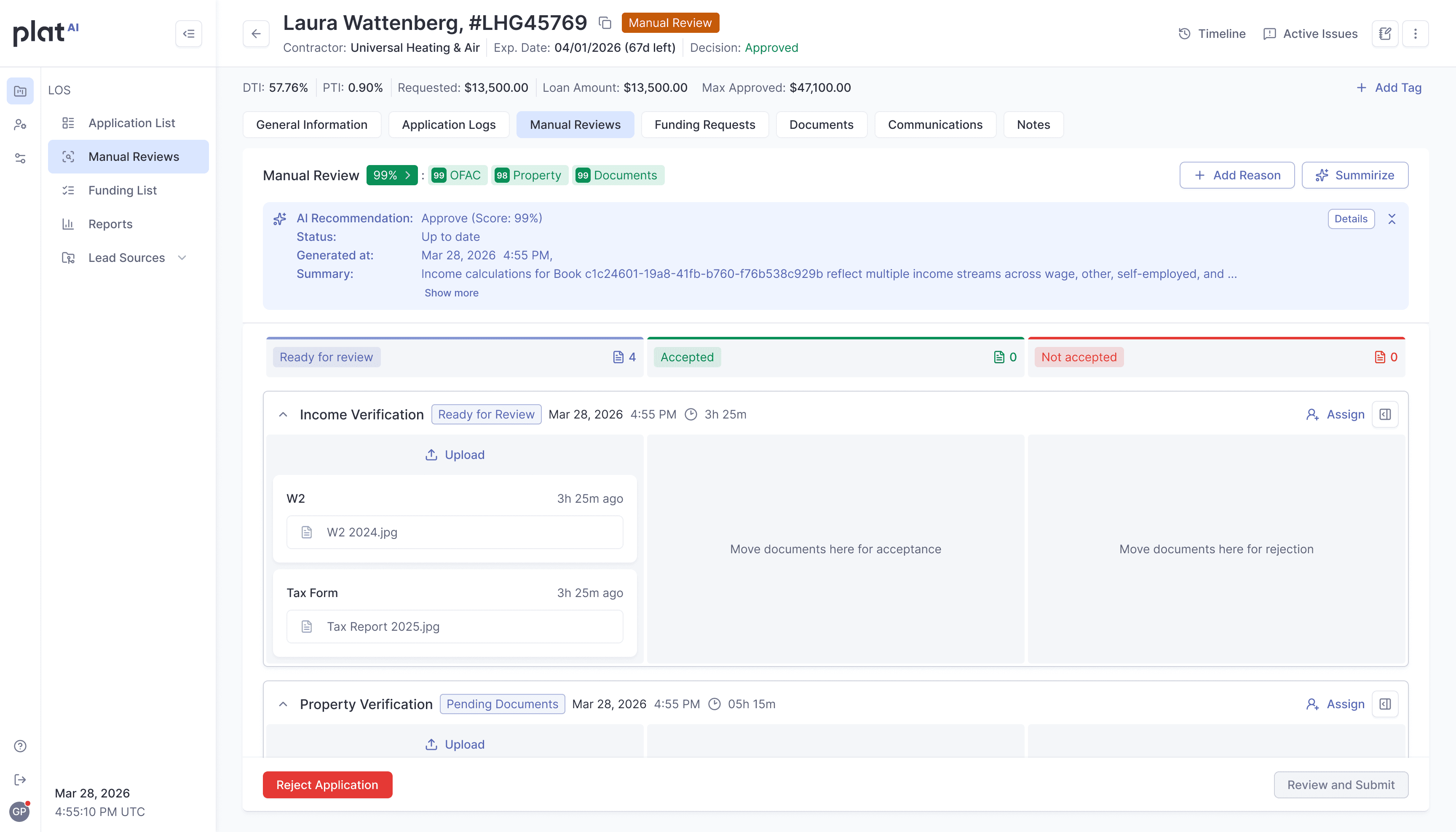
The project started with a request to integrate an AI recommendation into Manual Review, drawing on document analysis, OFAC screening, and property checks from providers such as Zillow, RentCast, Black Knight, and Cotality.
My responsibility was to design how underwriters would access this information within their existing workflow. AI would provide supporting evidence; underwriters would retain the final decision.
The constraints behind the request
Limited space
Manual Review was already an information-heavy workspace. Adding detailed reports directly to the page would compete with existing tasks and actions.
/01
Detailed evidence
Underwriters needed access to the findings behind each score to investigate discrepancies and make informed decisions. The interface had to keep this evidence accessible while presenting a concise overview.
/02
An existing component system
The solution also needed to fit our Material Design-based design system. I prioritized existing components and familiar interactions, extending them where the new information required it.
/03
Reframing the problem
The request was to add an AI recommendation. The design question became:
How might we make additional underwriting evidence easy to scan and investigate within an already dense review workflow?
I organized the experience into a compact overview on the main page and focused detail on demand. This gave each level of information a clear place.
A compact overview using Chips
Our design system is built on the MUI design library, so I prioritized reusing existing components wherever possible. I identified the Chip component as a compact way to display scores returned by verification integrations. By adapting it to include a score, I could surface useful information within the limited space of Manual Review while keeping the interface consistent with the design system.
For scored verifications, I designed High, Medium, and Low variants, alongside separate states for checks that had not yet been triggered and response errors. This kept a missing or failed result distinct from a low score.
The indicators shared a consistent visual structure while preserving different meanings: an approval score for an AI assessment and a match count for OFAC screening.
This extended a familiar component to communicate both verification results and system states within a small footprint.
Connecting new evidence to recommendation freshness
I added a “New” state to verification Chips to identify data that had not yet been incorporated into the current AI recommendation. At the summary level, “Out of date” indicated that the recommendation needed to be regenerated.
Together, these indicators connected the source of a change with its effect on the overall assessment. Underwriters could see which verification contained new information and understand that the existing recommendation did not yet reflect it.


Dedicated Drawers for each verification
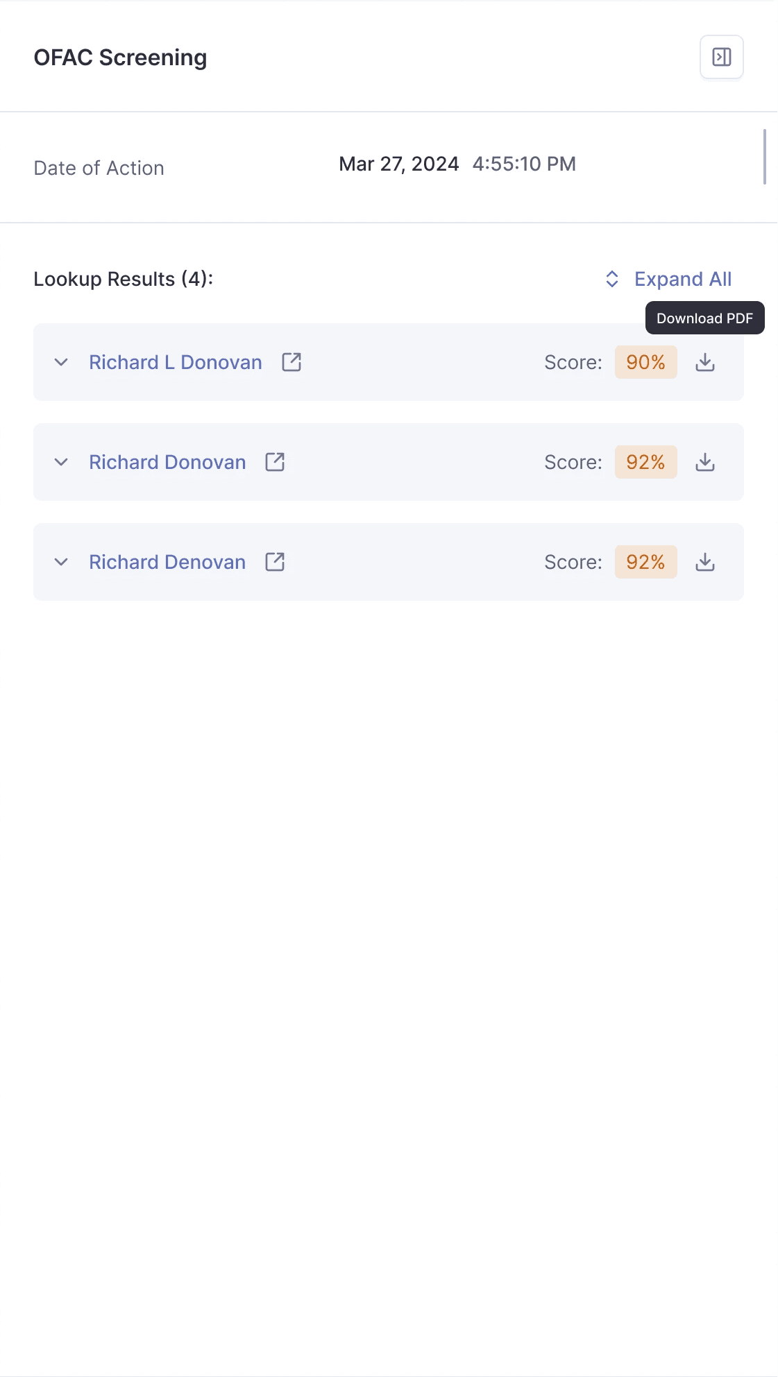
Each verification opened its own Drawer. The AI recommendation had a separate Drawer for its summary and supporting information. Underwriters could investigate a specific result within the application context.
I reused the established Drawer pattern across these views, keeping the interaction consistent while giving each verification its own space.
For OFAC, a returned match count opened the details for investigation. A zero-result state displayed "0" without an unnecessary interaction.
Property Verification Drawer

OFAC Screening Drawer
Managing content inside the AI Drawer
When the AI summary expanded, the Log section header remained visible. Opening the Log collapsed the summary, keeping both sections accessible within the available space.

Designing for changing recommendations
The AI summary needed to communicate the recommendation, its freshness, and situations where the system could not provide a result.
I designed High, and Low approval-score variants, alongside Out of date and Error states. When new documents or other data arrived, the previous recommendation became outdated and required a new check. An error had a separate presentation, distinguishing a failed result from a low approval score.
Using the existing Alert component, I created expanded and collapsed summary variants. Underwriters could reveal more context or reduce the summary’s footprint while working through Manual Review.
Together with the compact Chips and dedicated Drawers, these states gave the information different levels of detail while keeping the experience consistent with the design system.
AI Recommendation: Up to Date · High Approval Score
AI Recommendation: Out of Date · High Approval Score

AI Recommendation: Up to Date · Low Approval Score

AI Recommendation: Up to Date

Design decisions and trade-offs
Because findings and next actions were already present in the note content, I did not want to create a new documentation workflow.
I added two lightweight, optional fields.
Compact overview
Chips preserved space for review tasks. Detailed investigation required opening a Drawer.
Reuse with a targeted extension
I added scores to the existing Chip pattern where relevant and reused Drawers to keep the new capability consistent with the product.
Separate verification contexts
Dedicated Drawers focused each investigation. Cross-source interpretation remained in the AI recommendation, where feedback identified a need for more contextual summaries.
Visible freshness
The Out of date state made the need for a new check explicit when underlying evidence changed.
My contribution
I defined the overview-to-detail hierarchy, adapted Chips for verification results, reused dedicated Drawers, and designed interactions for managing content and recommendation freshness within the review workflow.
My contribution focused on presenting evidence and supporting investigation. The AI scoring logic was part of the broader product initiative.
Reflection
The initial design created a compact way to access additional underwriting evidence. Feedback showed that the relevance of the summary required just as much attention as its size and placement.
A concise overview is useful when it surfaces the evidence that matters to the review.
© 2026 tetyana.voronova
My contribution